Instagram Store Core
A Manifesto Against Avant-Basic Home Design
You know what it looks like, even if you don’t know what it is: bright yet non-aggressive colors, shiny plastics, checkerboard rugs, wannabe-Matisse prints. It’s playful without being childish, loud without being offensive, mismatched while being unified. It’s avant-basic mixed with Scandinavian design mixed with a touch of the Memphis School, and it’s the interior decorating style-du-jour of the internet.
Most of the individual items that fill these rooms are nice and well-designed. They aren’t garish or even in particularly bad taste. But there is something, some aura evoked when this specific combination of products and styles fills a room, that can only be considered in its entirety. Perhaps the best word is soulless—the same type of soulnessness of Blank Street coffee and Florence Given and university mental health awareness posters—or better yet, impotent.
If you want to decorate your space entirely with items found in the Urban Outfitters home section and your favorite influencer’s Amazon Storefront, so be it. No one will stop you, and you probably don’t care about my opinion anyways. But I am of the personal belief that design is important beyond its ability to “look nice” in photographs and I believe that the physicality of the objects we surround ourselves with has an impact on the way our spaces—and thus ourselves—feel. At its best, the way we adorn our home is not only an aesthetic practice but necessarily a spiritual one, and this intimacy is castrated when we fill our homes with things that are, first and foremost, commodities.
A search for “avant basic décor” on Pinterest yields near-endless results. The image sources vary: some are from Architectural Digest profiles, some are from Etsy ads, some are the homes of Pinterest users themselves. My first instinct is to notice that the advertisements are relatively indistinguishable from actual homes, but a moment of afterthought reminds me that this has always been the promise of advertising—furniture ads look like homes you’d want to live in, homes you’d want to live in look like furniture ads. That’s not unique to this style of decorating. As I rearrange screenshots of these posts in Photoshop to fit into a single image, I’m struck by something else, something that seems far more significant.
As I scroll through a blur of baby blues and pinks, something catches my eye: of the first dozen or so results, at least seven feature posters for flower markets. In many ways, this is unsurprising; you’d be hard-pressed to find a time in which florals weren’t a popular design motif. They go with everything, they can be photographed or drawn or printed to fit within the aesthetic sensibilities of almost any style, they can be tiled into delicate patterns or blown up into one single three-foot daisy. But these are not posters for flowers. Every single one of these posters is for a flower market. They are not posters that were designed to communicate the image of a flower, but rather to advertise a space in which goods are available for purchase;1 the poster evokes not the flower itself but the promise of fulfillment that derives from its consumption. What could be a more apt portrait of a design style not meant to display any certain personal taste, but simply the idea that someone has personal taste, accessed through the act of consumption alone?
If one individual embodies Instagram Store Core, it would be Dani Klarić.2 The 23-year-old, Miami-based “interior decorator / creative director” has amassed a social media following that includes over 600,000 Instagram followers, 90 million Tik Tok likes, and a profile in Architectural Digest. In her artist’s statement for a collaboration with Walmart, she writes, “My two favorite styles are postmodernism and the Renaissance era, which is kind of strange.”3
Klarić and I like many of the same things: Yoshitomo Nara, the designs of Jonathan Adler, vintage Formica bedroom sets. I think other aspects of her interior designs are underwhelming and uninspired. She first came to my attention when I saw a video of her flipping through A Bigger Book by David Hockney, an oversized art book with a $5,500 price tag, inside her home which she has named Miami Eclectic. You can find her living room, guest room, and bedroom (complete with the iconic and controversial spray-insulation foam mirror) catalogued in the portfolio section of her website.
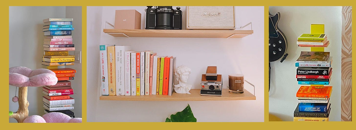
I think the most compelling aspect of Klarić’s oft-imitated aesthetic project lies not in the visual, but the literary: her bookshelf. Most of the books in her home—at least the most prominently displayed ones—are art, photography, and design books. The two books in her bedroom display photographs of the English countryside and stills from Kubric films, and a feature wall in the living room contains the work of Hockney, Bosh, Warhol, the Bauhaus movement, and Emilio Pucci, among others. Only a few chapter books can be found in Miami Eclectic, some sit on a small shelf in the guest bedroom, some hide behind her cat’s perch, and a stack of books can be found somewhere in the living room. Many of the books in one stack reappear in another. A few of them are vintage, meant as décor. Some are art books. I could identify three pieces of fiction: Turtles All The Way Down by John Green, Casual Vacancy by J.K. Rowling, and Get A Life, Chloe Brown by Talia Hibbert.
The rest, comprising the overwhelming majority, are self-help books. Their titles include: Hug Your Haters; Your Fully-Charged Life; The Intelligent Investor; Wheat Belly: Lose the Wheat, Lose the Weight, and Find Your Path Back to Health; Unapologetically Ambitious; How to Survive Change You Didn’t Ask For; and Outliers by Malcom Gladwell. Klarić’s Amazon storefront offers a section called “Books” which is subtitled “books I LOVE- mostly related to personal growth and success” and advertises ten more self-help titles.
To be clear—Klarić doesn’t need to be reading Dostoyevsky and Derrida, and her value as a person has no bearing on how academic her bookshelf is. What her literary tastes reveal is the centrality of “success,” “hustling,” and “influencing” not only in her personal life, but in her design philosophy—and the design philosophy of Instagram Store Core as a whole.
Dani Klarić is not the most famous influencer in her family. The first time I saw a video of a then-22-year-old woman opening a $5,500 art book, I did what any nosy and bored person would do: I made a mad dash to the Google search bar for DANI KLARIC PARENTS? before quickly finding exactly what I was cynically expecting to see. Her father is Jurgen Klarić, who is (according to his own website) “the most widely read business and human behavior influencer in the world.” He is a platinum social media poster, public speaker, and educator: you can take his courses on real estate investment, neurosales, or starting your own multi-level marketing scheme. Dani is certainly not her father (and doesn’t seem to be running any pyramid schemes of her own), but it is clear that her grindset is patrilineal.
What is a “successful” home? In the digital age, a successful home is a home that photographs well. Engagement from those photographs leads to the acquisition of social currency, which becomes cash revenue: ad sales, sponsorships, gifting deals. To photograph well, a space needs to be well-organized and balanced (a compositional strength that not everyone possesses). A space also needs to be distinct enough to hold market value while universal enough to fit into market niche. It should be aspirational to the point that people want to look to it and at it as a point of inspiration, but not so luxurious that viewers become resentful or feel its inhibitor is out-of-touch. Instagram Store Core is pleasant and inoffensive and impersonal. There is a gesturing towards art history in the form of Redbubble Matisse prints and unlicensed4 Keith Haring reproductions, but any depth or specificity is forsaken to maintain universality. Viewers can imitate the rooms they see on Tik Tok, Instagram, and Pinterest relatively inexpensively with items they find at Target or H&M Home, but crucially they continue to aspire to the luxury feeling and social exchange value that comes with owning a certain vintage chair or an art book that costs as much as a used Subaru.
Instagram Store Core is the friendly blankness of a cover letter, a polite smile from across the Sweetgreen. Instagram Store Core is the girlboss answer to maximizing the profit value of your personal space—each purchase promises a return-on-investment in the form of likes and shares. Instagram Store Core is an assertation of identity: it is put-together but still fun, pristine without being uptight, as if the hardworking-but-clumsy Rom Com protagonist of the early aughts became a style of home décor. Most importantly, Instagram Store Core is nothing at all. It isn’t Memphis School design. It isn’t Scandinavian minimalism. It isn’t 90s Teen Bedroom Maximalist Kitsch. Klarić describes this ahistoricity as postmodern, but there’s a far more obvious and far more true term I’d use: simulacra.
Pastel pink checkerboards and Astrology-themed prints aren’t typically seen as the aesthetic of hustle culture, but maybe they should be. At its heart, the popularization of Instagram Store Core reaffirms a growing sentiment in digital culture: everyone is a content producer, everything is content, and we should always be posting. Not only must our minds exist in a perpetual state of profit-seeking, but the physical space around us must also be an incubation—or, to use Klarićs favorite self-help language—a manifestation of accumulation.
I said I didn’t care how other people decorate their homes, but really, that isn’t true. The truth is that the coldness of these styles makes me a bit sad. My home is the place where I am supposed to have my problems solved by a hot shower and a cup of tea. It is the place where I have decided I will burn ocean-scented wax melts because the smell reminds me of growing up in Maine. It is the place where I try my hardest not to think about SEO engagement and building a digital brand identity; if I want to worry, I get to worry about therapy-sized questions where at least there’s some self-discovery at the end.
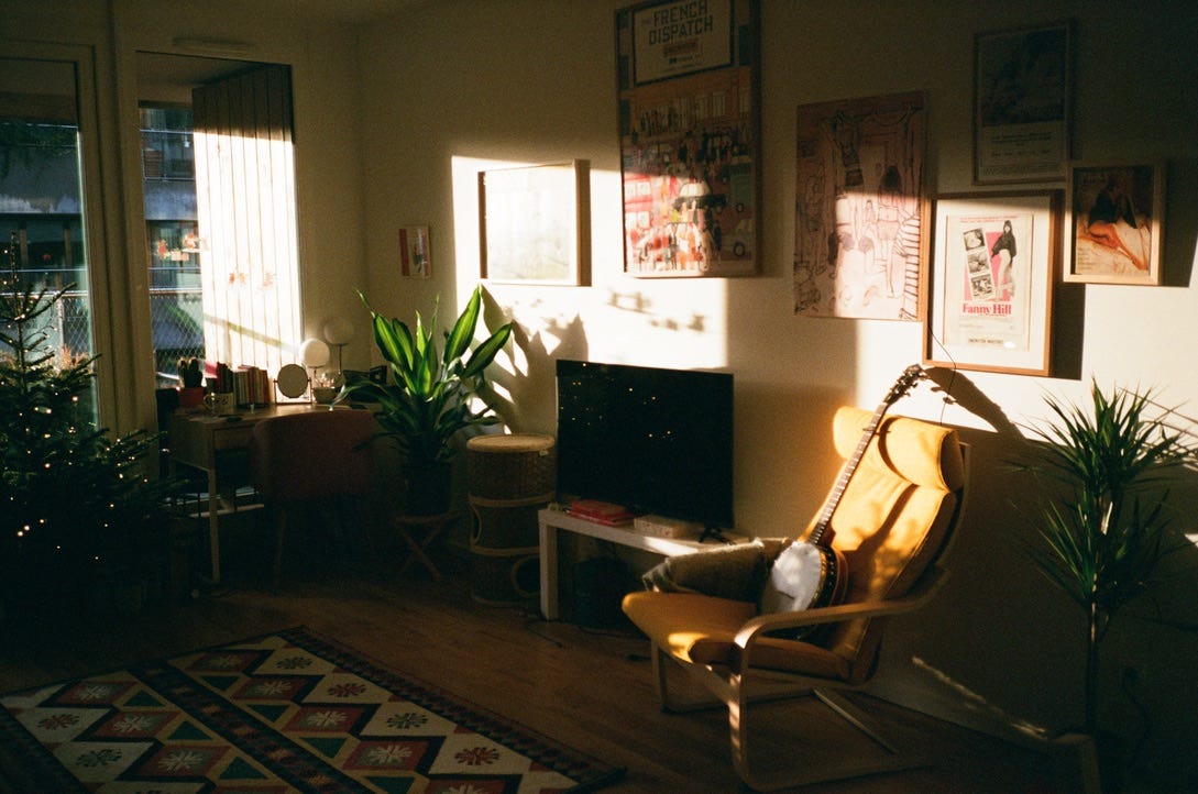
I love when things are cohesive and well-organized, and I am a big fan of my mustard-yellow reading chair and the pillowcase with embroidered daisies on it. But most of all I want the objects in my home to really, genuinely remind me of love and laughter and compassion. Many of my favorite things in my home match my aesthetic sensibilities—built from my favorite films and novels and paintings—but even those that don’t still match my moral and political sensibilities, which feels like a much truer cohesion. Charlie and I have a great big fifty-five-year-old poster of Goddard’s La Chinoise in our living room, partly because we watched it on one of our first dates, and partly because I believe there is a special, transient property in objects that hold history. There’s this great big object in my home that other people—maybe people whose books I’ve read or films I watched—also saw before walking into a cinema screening that challenged their perceptions of politics and of filmmaking. In the kitchen we have two Matchbox-style cars: one of a yellow 1970s Honda Civic, which looks an awful lot like the decade-old Honda Civic I’ve driven across New England to meet countless friends and lovers, and another of a USPS car because I love love letters and my local post office and the inconvenient, aero-undynamic, and very adorable boxy shape of the trucks. In the bedroom there’s a painting of a mouse, whose body is made from someone’s thumbprint, and he’s sitting in a corner office and reading a copy of Sports Illustrated in a New York high rise. I paid $20 for the painting at an estate sale I went to with Malchijah in Saratoga Springs, because reminded me of my own pet rats and it made me laugh. Every time I look at it, I get to thinking about how the person who made it probably came home from a class at the library or the community college and showed it to their daughter or husband or co-worker and they laughed, too.
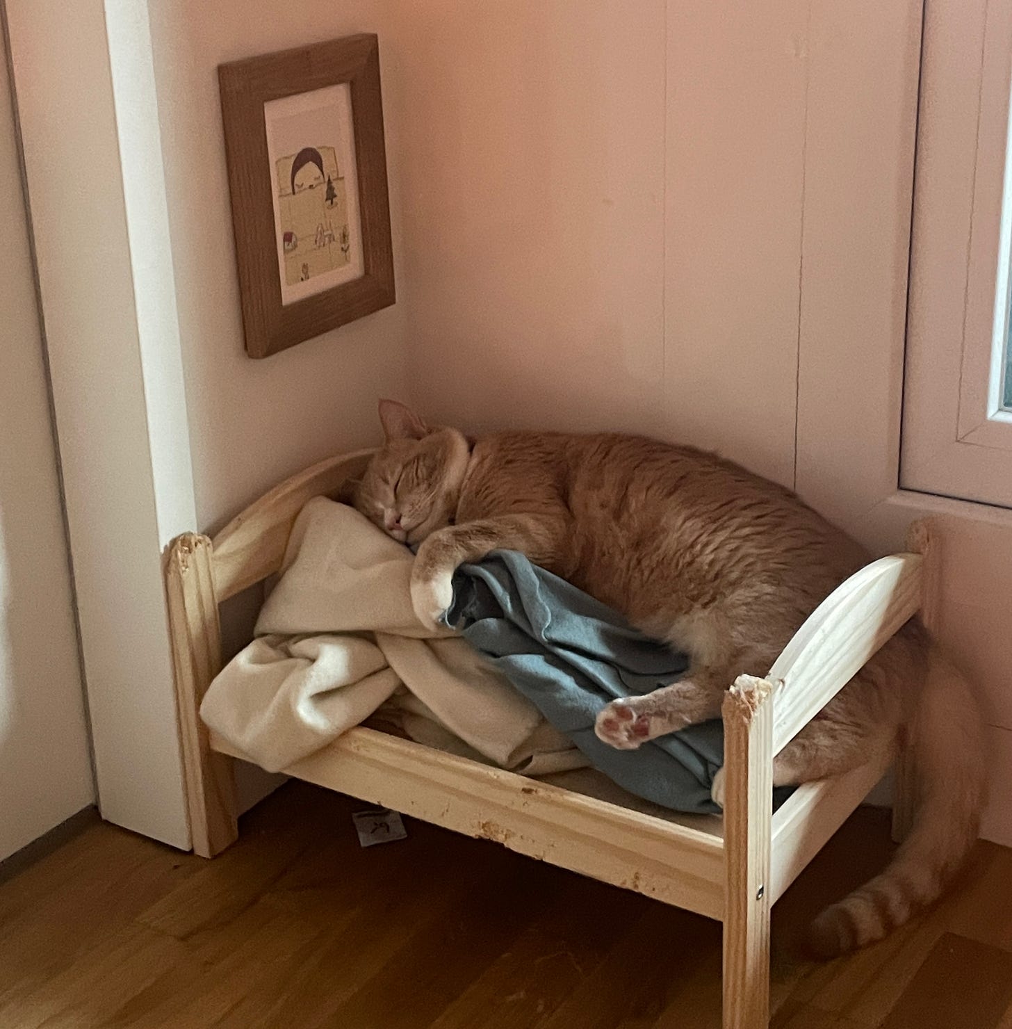
If you zoom into photos of these spaces close enough, something will eventually disrupt their façade of unity. You might notice a patch of hair that came from a tuxedo cat, or a framed photo from a decade ago taken at Girl Scout Camp, or a handmade birthday card from a friend, or a condensation ring on a glass table from a wine-and-cheese date night. It is these very expressions of character, even the ones that are entirely accidental, that turn space into home and living into life that bring us genuine joy. These are things that should not be scrubbed away, forsaken in the name of peak Pinterest performance, but instead should overflow in our homes and hearts.
Author’s note: Three-quarters of the way through this essay, I was reminded of a piece from Blackbird Spyplane about the “Ungrammable Hang Zone”—if you haven’t read it, you should check it out! There is also no one on the internet with a more infectious passion for attention-to-detail in industrial and interior design than Nora Peterson on Tik Tok.
More realistically, they were never designed to advertise any legitimate event but just to serve as decor. Another note: of these seven posts, four of them seem to be displaying the posters from this Amazon listing.
Dear Dani, on the chance you should ever read this: I do not know you and I do not have any strong feelings on your personhood or character. I find some things about your style to be… philosophically grim and also quite boring. If this makes you feel bad, I am sorry, I may be critical but I do not try to be mean. If it makes it any better please know that I am a bitter person and a pretentious loser and you have way more money and clout than I ever will. You live in Florida where it is sunny and warm and I live in Berlin where it is cold and gray and there is no good Mexican food. Kind regards, Charlie <3
One could argue that the “Renaissance era” is not a style but, in fact, a time period.
I love Keith Haring, but make sure that your money goes towards products licensed by the Keith Haring Foundation, which uses the profits to fund HIV/AIDS education and advocacy projects :)


I love this dissection. However, I do kind of like the Instagram store core in small doses.
the very generic "flower market" prints are really interesting to me because they provide the illusion of what I think of as "corporate artisan." It seems vintage, authentic, maybe printed my a local artist or found on the wall of a small business- yet it's bought on amazon, mostly because it's trendy and cheap. I feel like it points to a general unwillingness to actually support local artists and compensate them a fair price for the work they made. People love art until they have to pay for it.
Loved this article!